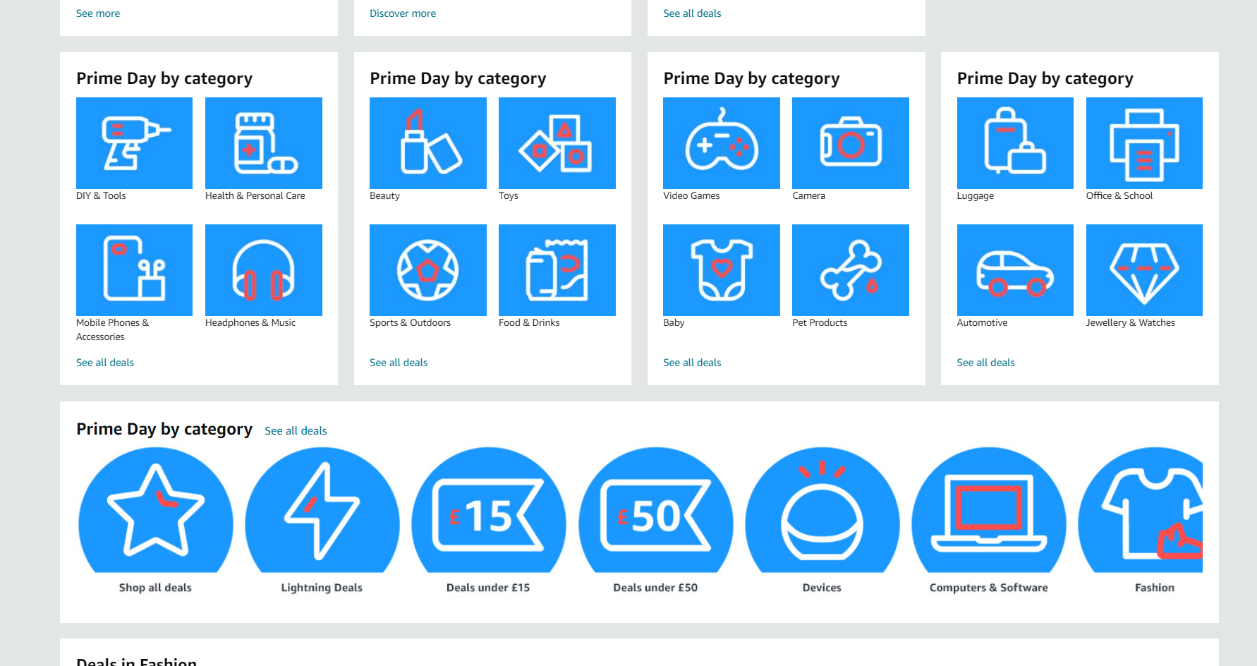
the amazon front page, all icons are white outlines with a splash of red, they're very homogenous and it's hard to tell them apart
https://cdn.raru.re/media_attachments/files/112/803/533/167/621/253/original/cf0cbf418ea31b8b.png

im sorry this icon style that google, microsoft and now amazon are doing is driving me crazy i cannot tell the difference between any of these it makes me feel like i have dyslexia but for shapes
076萌SNS is a social network, courtesy of 076. It runs on GNU social, version 2.0.2-beta0, available under the GNU Affero General Public License.
![]() All 076萌SNS content and data are available under the Creative Commons Attribution 3.0 license.
All 076萌SNS content and data are available under the Creative Commons Attribution 3.0 license.